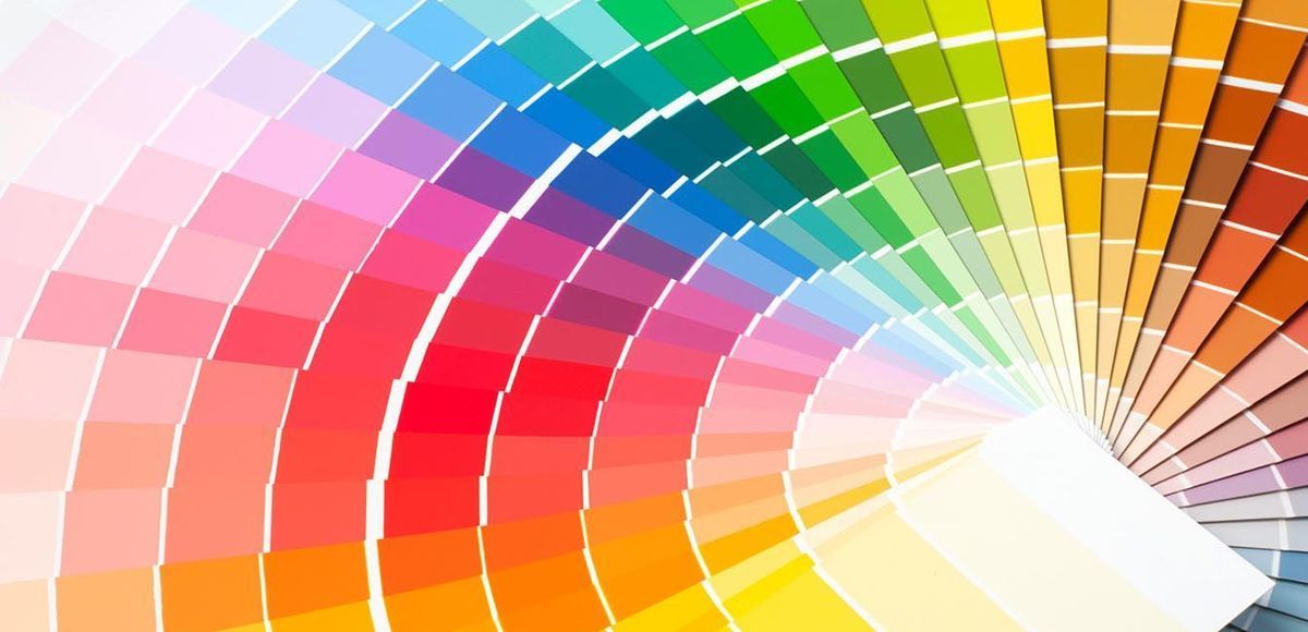
Many experts and social media outlets name their colors of the year at the dawn of the new year, and Pinterest Predicts says that “Rust Married” is one of this year’s trending event colors, particularly for weddings.
“So long, something blue. Hues of terra-cotta, copper, and burnt sienna will be frequent guests at weddings this year. Based on rising searches from millennials and Gen X, you’ll see this smoldering color everywhere in 2023, from floral arrangements to bridesmaid dresses. And hey, if a big wedding isn’t your thing, you can-elope (sorry),” writes Pinterest Predicts — and we don’t endorse the pun.
As unusual as a rich, dark orange hue may be for a wedding or other event, it’s not outside the realm of possibility. As Pinterest points out, “Orange is associated with optimism, adventure, and creativity. As people plan for sentimental moments in their lives—like weddings—it’s no surprise they’re bringing a color with such sentimental significance into the spotlight. Pastels as a wedding staple? We object.”
But orange isn’t just for weddings in 2023. “Because it’s associated with optimism and energy, many brands use orange to convey a message of positivity. If you’re looking to get your audience excited about something, go for orange. It’s an attention-grabbing, warm color that stands out when combined with cool blue or green tones,” Adobe notes.
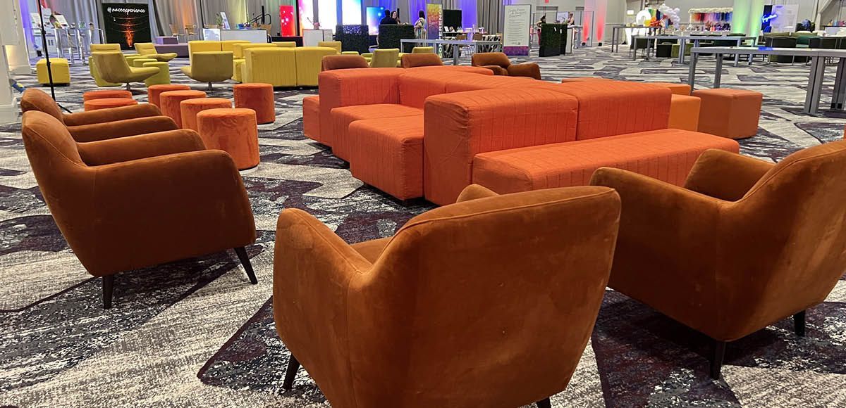
Orange is a terrific choice for an attention-grabbing and positive event because of the feelings that it evokes, and it’s easy to bring shades like “Rust Married” into your events in 2023 for a sophisticated orange tone. In this article, we’re going to explore how to incorporate orange into your events, usingComplement With Wood Tones
as a sample furniture piece.
Complement with Wood Tones
The rich, earthy tones of this shade of orange pair well with natural elements, particularly wood tones. “To enhance the warmth of these rich red-oranges, such as paprika, consider pairing them with plenty of natural materials such as wood and textural linen,” writes Pippa Blenkinsop at Homes & Gardens. Bringing in natural wood elements helps balance the space and complement the orange tones harmoniously.
The high energy of orange doesn’t have to exclude comfort, and that’s where wood accents come in as a way to add comfort to a space. Choose wood materials that bring out and complement the orange tone of the chosen statement piece. Going with our example of the Valencia Chair, the Sydney Cocktail Table matches the chair with subtle hints of orange. The Jacob Wood Table offers a darker wood option that ties in well with the burnt orange hue of the chair.
Brighten Neutral Spaces
Another advantage to incorporating orange into your event designs is that it matches well with neutral tones and colors. “Orange is a wonderful accent color for gray, so if you love the idea of having a dark living room but are cautious about the space feeling too cold then consider adding a vibrant orange sofa to help warm up the space,” Blenkinsop writes.
While neutral colors can bring calmness and a clean aesthetic to a space, they can also feel a bit drab if they dominate. For example, if you’re using the gray Sterling Sofa and gray Grand Tour Rug as primary furniture and decor pieces, it’s easy to notice the lack of color — even as striking as those pieces are. Break up the monochrome with the burnt-orange Valencia Chair and add a Solid Pillow in Pumpkin Spice as an accessory for the gray Sterling sofa. These pieces allow you to bring in the energy of orange without using it as a dominant color.
Partner with Bright Pops of Color
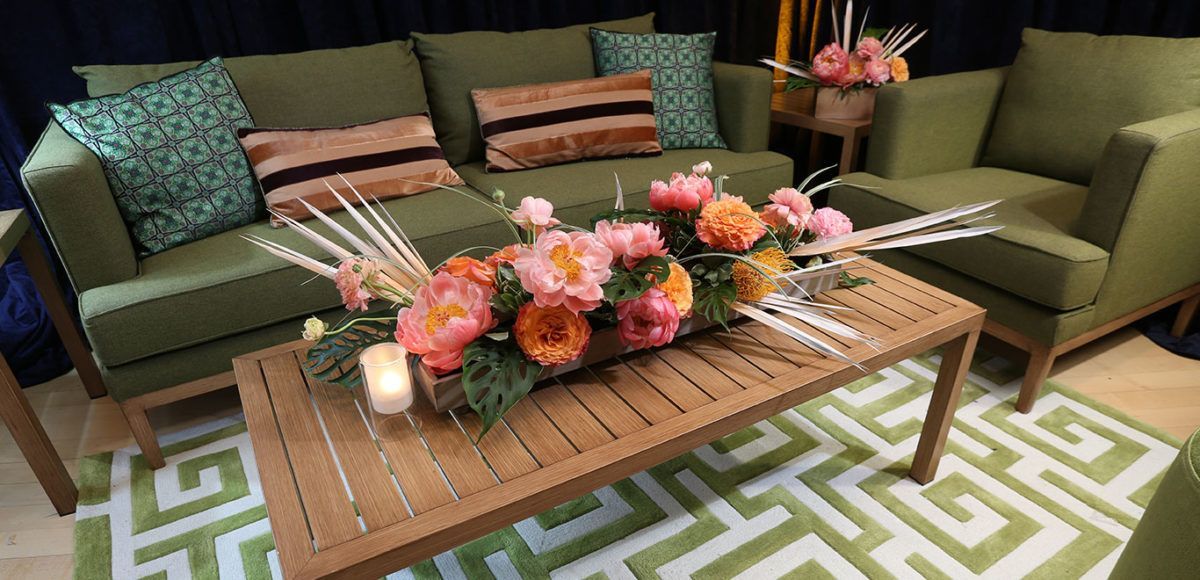
An energetic orange surprisingly pairs perfectly with bright, contrasting colors. “Burnt orange makes fabulous partnerships with teal and with surprise elements of subdued blush pinks,” Blenkinsop writes.
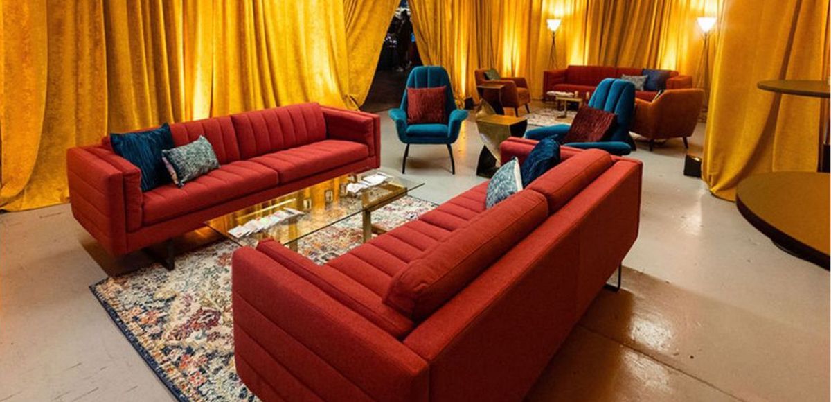
Let’s explore how pops of color can marry with a burnt orange by starting with our example of the Valencia Chair and pairing it first with the Endless Low Back Curved Sofa in a clean, neutral white. Combine these pieces with the Nile Rug, which features multiple colors including both teal and burnt orange. Pillows like the Shimmer Pillow in deep teal or the Frayed Lumbar Pillow in teal add an accent color in small ways, while the Marche Swivel Ottoman in teal velvet can serve as a contrasting pop in a larger piece.
In seating areas, whether onstage or in conversation areas, the Valencia Chair looks especially nice alongside the contrasting teal Malibu Chair and the neutral white Baja Chair.
Layer Orange Tones Using Textures and Patterns
In addition to pairing burnt orange with neutrals and pops of contrasting color, you can layer complementary tones of orange with different patterns and textures. “When decorating in a single hue it's important to factor in plenty of variations in tone and texture to ensure the scheme has life and depth, otherwise orange rooms can run the risk of feeling flat,” Blenkinsop suggests.
In CORT’s Valencia Package, we can see the Valencia Chair paired with other orange pieces in different hues and textures. The Frayed Lumbar Pillow in spice orange contrasts with the velvet chair with a different texture even though it’s the same hue. The Morocco Rug, which has subtle pops of bright orange in a Middle-Eastern inspired pattern, is also part of the package. Finally, the bright Galactic Side Table makes a statement with its geometric design and metal material.
It’s easy to change up this package design as well. Swap the Morocco Rug with the Nile Rug and its distressed pattern or trade the Galactic Side Table with the Marche Swivel Ottoman in Orange, which has a different orange texture and hue and can double as additional seating. Having options within a package allows you to make custom changes to your event space.
Orange Is the High-Energy Color You Need at Your Next Event
Since one of the main focuses of today’s events is providing experiences and opportunities for authentic connection and networking, orange is a must-have color at your event. “Orange is a color that invokes excitement and enthusiasm. It’s also commonly associated with extraversion. This can come in handy if you’re planning events with a substantial networking component, as you can use orange strategically to encourage attendees to interact with one another,” writes Jessica Stafford of the Event Leadership Institute.
Our example of the Valencia Chair demonstrates just how versatile orange can be. You have plenty of options, from complementing orange with wood tones to using it to brighten neutral spaces to bring in pops of contrasting color to layering tones of orange in various textures and patterns.
It’s easy to make orange a focal point of your next event! CORT Events not only has the Valencia Chair and every other furniture piece and accessory we’ve talked about above, but CORT also offers a suite of complementary, interactive planning tools and loads of expertise to go along with those tools.
Bring orange into your next event by harnessing all that CORT Events has to offer.
